With so much digital content vying for our attention, medical communicators need to harness the power of visual communication. Otherwise, high-quality health care messaging could end up buried in a sea of social media reels and misleading posts.
Today’s medical communicators have access to tools for creating engaging visual content. Visual elements such as graphs, maps, infographics, and images can keep health care content visible to target audiences while elevating health care communication in significant ways.
There are many benefits to using visual communication tools and techniques in health care communication.
The Advantages of Visual Communication
Maps, graphs, images, and infographics can help medical communicators to
- Tell a story quickly. Your audience can often quickly grasp the meaning of a carefully crafted infographic or graph.
- Simplify complex information. A data visualization showing clusters of a disease on a map of the world may give a clearer impression of disease concentration compared to a list of percentages by country.
- Improve health literacy. The Centers for Disease Control and Prevention advocates for using visual communication to boost health literacy. Visuals are universal and help people access health information, especially those whose primary language is not English or who have a low literacy level.
- Leave a visual memory. Visual elements can make a lasting impression that remains in the mind longer than text does.
Types of Visual Elements
Health care communicators can choose from many kinds of visual representations. The list of possibilities includes
- Diagrams
- Infographics
- Photographs
- Illustrations
- Videos
- Tables and graphs
- Maps
Some of these options can be considered data visualization, which uses elements like graphs, charts, and maps to represent information, usually large sets of numerical data.
There are numerous types of charts and graphs, ranging from bar graphs and scatterplots to pie graphs. Each kind has strengths for showcasing different types of information. In general, data visualization tools can provide an intuitive look at patterns, trends, and outliers.
Choosing the Best Visual Format
A first step is to decide which format will best convey the information you want to highlight. If you are new to visual communication, you might start by collecting examples of effective visual elements in health care communication. These can help you to see which visual formats work well to communicate which types of information.
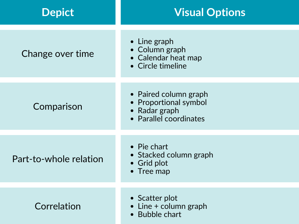
An AMWA Journal article based on a conference presentation includes a discussion of how to select appropriate visuals to support health care content. It also includes the following table with guidance on choosing visuals to convey different types of information:
To get started with selecting the right visual approach for content, health care communicators can ask some guiding questions.
- Who is the audience? A public health message going to the general public will require a simple, engaging graphic that can be easily grasped.
- What is the goal of the message? If you are teaching health care professionals a framework, a diagram showing the relationships of the parts may be helpful.
- What is the medium where the content will live? A social media post may benefit from a simple infographic that draws viewers in to read more in a linked article.
- What information is available? If you are focusing on a data set that details the number of people smoking over the last 20 years, you may want a line graph that can easily show trends over time.
- Do you want to engage people emotionally? A carefully chosen photograph—thinking about what will move your audience—can enhance health care content.
Reviewing Visual Communication in Health Care
Just as an editor reviews written content and recommends revisions, medical communicators can cast a critical eye on visual elements to improve results. Consider these questions to evaluate the success of approaches to visual communication.
- Does the visual convey what was intended?
- How easy is it to understand the message?
- Does it align with any necessary branding?
- Does it use a diversity, equity, and inclusion lens?
- Are there any triggering images that might upset people?
- Is it engaging and memorable?
- Does the design effectively and accurately communicate the information?
Building Your Skill Set
Health care communication is an ever-evolving field that changes as new trends and technologies emerge. Visual communication is one key element that can enhance and improve the quality of health care communication in today’s digital world.
When medical communicators stay abreast of the latest visual technologies and explore new avenues in medical writing, opportunities open up for connecting with wider audiences.
For medical writers seeking to expand their visual communication skills, AMWA’s online learning activity Ten Characteristics of Tables and Graphs and the self-study course Tables and Graphs (Digital), part of the AMWA Essential Skills program, offer opportunities to explore the power of visual storytelling in health care while building your value as a medical communicator.
AMWA acknowledges the contributions of Abbie Miller, MWC, for peer review in the development of this AMWA resource.